28 sierpnia 2013

Step by Step: Tyrion Lannister portrait (pencil realism)


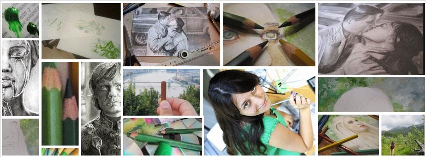
‘Game of Thrones’ is currently my favorite TV series, because I’m a huge fan of fantasy. I love especially incredible landscapes and complicated characters. On my <polish site> I already announced that every character from the ‘GoT’ will be done in different technique. In first ‘GoT’ I’m going to show You my favourite character (and favourite technique as well) – Tyrion Lannister <3  I love his voice, mind and his biting tongue. Here’s my done artwork:


So… lets get started!


For the photography I choose a screen of this scene:


The original photo has a very good quality and it's perfect as a base for a realistic artwork.


Let’s begin with the general tips for this drawing:

  • Don’t sharp your pencils and clean the eraser close to the drawing. It takes so much time to complete the detailed artwork and You don’t want to soil it and start again from the beginning. Also clean your erasers before using for the same reason.

  • If you want your drawing looks so realistic, choose the rigid and pure paper. I work on the photographic paper (on the second side) because it’s also more waterproof than regular technique paper.

  • Additional accessories (like white color pencil) aren’t necessary for the beginners. If you’re just begin with the realistic pencil drawings don’t use it. First try to draw with just pencils and erasers and then – if you achieve some experience – try addictions. For this drawing I used eraser in wood, white jelly ballpoint pen, mechanic pencil, white color pencil and non-wood pencils.

  • It’s good to use addictional clean sheet under the hand you use for drawing. You may also use a T-foil or piece of glass like on <this video>.

Sketch

I started with cropping the photo I choose. I wanted to draw Tyrion in the special frame in which we can see details of the face and interesting clothes (a stylists from the set of ‘GoT’ made a very good job!).

This time I don’t have a special photos from the sketching, because my first lines were so fine. You can read more about my sketching technique in the <previous post>.

On the sketch I was working with well sharped 2H pencil. I marked not only obvious parts of the face (like eyes or nose) but also shadows, because they’re very good landmarks. My goal was to copy all of the wrinkles. Thirst of all – they look so good in photorealistic style, second – they make Tyrion look as smart as he really is :)

The site of the head which is on shadow was a little bit problematic to sketch because it’s hard to see the details (they’re almost invisible)…

After sketching this almost invisible lines I refreshed the sketch with softer pencil (2B). Here you can see the result:


Shading eye areas

Before I started to shade I was carefully watching the photo of Tyrion. I tried to see what places are the darkest and the lightest. The base photo is not too contrast so I decided that on my drawing I’ll be try to improve it.

Firstly I shaded the eye parts. 8B pencil was perfect for the darkest places (like pupil and upper eyelid shadow). During pupil darkening passing of the eye flash was so important, because it should be perfectly white (usually this eye flash is the lightest area on the face). Usually the bigger this light is – the cutter the face looks. On this photo Lannister has a very cute gaze ans I really want to copy it perfectly.

The 5B pencil was so useful in shading eye areas. It’s enough soft to achieve the right tone without pressing too much. That combination (gentle pressure + soft pencil) yielded the rough surface  which is similar to this eye area. I drew also wrinkles because they look realistic.


If you can't see the details just scroll down to the end of the post to see finished artwork in good quality.


Starting up with soft pencils I replaced them with harder. Don’t try to achieve a perfectly pure face. All of this wrinkles, beauty marks, blackheads make the face more interesting and wise looking. Try to highlight the contrast between shining iris and matte skin.


Finishing touches I did with the hardest pencils like 2H and HB. It’s very important to shade also the ‘white’ of the eye, because – in fact – it’s not perfectly white. It should be a little bit darker than the flash in the pupil.


Shading Nose

The most important think in the nose shading is to avoid hard looking lines. They make the face looking flat. Especially you have to take care about the ‘smile wrinkles’. Don’t expose them too much. Try to keep it quiet similar to the other parts of the face and blend then a little bit. What’s more – these wrinkles aren’t just two lines – they’re rather a collections of the smaller lines (check it out on the photo close-up).

During shading look at the photo in general and check from time to time how do the shadows look on the whole face and how do they look together. Ask yourself: ‘Is this nose shadow lighter or darker than hair?’, ‘Does the chiaroscuro look similar on the photo and my drawing?'.


Important tip: let see how dark is the nostril. Probably it’s quiet lighter than You expected. Compare this tone with the others on the face.


My method to copy the chiaroscuro is to divide it into pieces. These pieces are kind of puzzles – they fit together perfectly. See how it looks like on the photo: 


Every time I draw I try to look only on this imagined ‘puzzles’ and skip the rest. If the shadows are more complicated try to divide them firstly into bigger pieces and them into smaller and smaller. Like here:


This is the fragment of my tutorial about drawing a scene from 'The Hobbit' movie with color pencils. The post is coming soon :)


This ‘rough’ surface of the nose area I achieved with the eraser in wood. 


That ugly stain close to the up-right corner is only some dirt on ma photo camera. Don't worry :)


Shading the part of face in the shadow

Drawing the second eye is always a little bit stressful because we want it to looks the same ad previous one. This time this second eye should be a little bit different (little bit darker), because it’s in the shadow. In the ‘Song of Ice and Fire’ (the book of G. R. R. Martin which the series is based on) Tyrion has different eye colors also.

The skin I made the same way as right site (from the softest pencils to the hardest) but I used a softer combination: 5B (at the beginning), 3B and B. I did many layers to gain that pure surface (it’s much more pure than lighted site, because we cannot see wrinkles)


Drawing hair

I always start to draw hair with the quick sketching of the main hair strands. Beginners so often draw whole hairstyle with the same way and it doesn’t look so good. You don’t have to copy the hair perfectly (hair does not affect the similarity), but it is worth to take some time to precise shading. The coiffure should be as detailed as the face. A nice idea is to shade pure the hair before adding single hair. It makes it look thick and tree-dimensional. When you draw the hair don’t make it with the one chaotic line. Try to use many (many many many) short (yes – short) lines which are so close to each other. Every line can be in a little bit different hue. Places when light is reflecting in the strands you can do the same way but with harder pencil.

I started up with the soft pencils (like 7B) and then added some strokes with 4B, 3B.


At the end I erased this really cute looking light hair on the top of the head with the eraser in wood. That kind of eraser is perfect for this job. I also added several thin hair.


Drawing the clothes

This wear was one of the hardest I ever draw. Tyrion has something which looks like openwork leather and some harsh material with shining thread underneath. But anyway I decided to do this as good as I can.

So… I started with quick sketch of the openwork pattern. I didn’t copy it with precision. My pattern is only a little bit similar to the original but it has some regularity.


Then I darkened the holes with the 8B pencil.


After that there was a time to shade the rest of the waistcoat as well. The Darkest places are done with 8B, 7B and 5B. Pencil marks I hide using a circular motion.


The lightest areas I refreshed with the eraser, because such soft pencils like 8B really like to smudge. I cleaned a place where the hand of the king brooch is as well.


Here is also the close-up of the metal details of the clothes.


Right site of the waistcoat was more difficult to draw than the left one. It’s because this shining material underneath.  Process of drawing looked pretty similar at the beginning.


But this time I shaded holes with 8B pencil and low pressure, so it looked like worsted material.


The fabrics have so similar tones so I decided to contrast them with different kind of surfaces. As I done the fabric underneath with low pressure, the leather I finished with hard pencils and many layers. I used also a white color pencil as a blender (you can also use a regular blender or wisher).   


At the end I refreshed the whitest areas one more time with diffrent kinds of erasers.


The smudged background

As you can see I changed the background a little bit. I wanted to have all of these interesting fragments on my drawing so I slid it closer to Tyrion. Now it looks more interesting (and more realistic than uniform) in my opinion.

I started with the outline of the column. Then I darkened the surface. As I once sais, Progresso pencils are so good for the smudging.


Quick tip: protect the finished areas of the drawing with clean piece of paper.


After that I choose another Progressos and continued darkening with 6B and HB (Progresso HB is a little bit softer and darker than regular HB pencil).


As on the previous tutorial (check <here>) for smudging I used a cotton pad. Don’t recommend doing this job with fingers! They may be dirty or oily and it can ruin the artwork. Also – try to blend the pencils carefully and not chaotic. For example this column is vertical so my motions were the same.


Usually the first blurry layer doesn’t look so impressive. But don’t worry – just put another one. And another. Simply – as much as you need to receive to obtain the satisfactory result. Between blending and shading find a time to highlight the areas which need it.


Here you can see how it looks in progress:


Final touches

Although I used additional piece of paper to protect the finished parts of the artwork, they smudged. I needed to improve them one more time using hard well-sharpened pencils and Faber-Castell eraser (that one which looks like a pencil). I also used a jelly white ballpoint pen to draw the light sparkling dots on the eyes and jewelry. I protected the drawing using a hairspray as well.


Here’s the finished artwork:


Good luck :)


27 sierpnia 2013

Drawing Diary: Breakfast at Tiffany's (pencil photorealism)

Drawing Diary is a category when I show how many days and hours took drawing. I choose for this usually photorealistic artworks, like this one today. As usual in ‘DD’ category the final drawing is showed at the end of the article, because I want You to feel uncertainty.

So… ‘Breakfast at Tiffany's’. The famous ‘rain scene’ is perfect for realistic pencil darwaning becase water usually looks perfect in photorealism (check out for example <Eric’s Zener artworks>).

18.VII.’13 Warsaw, Poland
Today I have so many household duties: laundry, doing the washing up so… it’s a perfect day to start a new commitment requiring artwork. Since I moved to studies I don’t have my own desk so I work on the kitchen table. My workplace looks as below:


The products and other things I used: 
  • Notebook with digital photo of the ‘rain scene’
I use a computer because I need to write an articles during drawing but you don’t have to! It’s so important to be off-line when You work on new sketch. It’s because Facebook and other sites which distracting. Try to print a photo of your choice and work on it. It’s so much better, I swear!
  • Pencils
As usual I’m using my KOH-I-NOOR set (2H – 8B; I have no idea what scale is using in other parts of the world) and KOH-I-NOOR Progresso (non wood pencils). Also: two STABILO pencils (HB) which are perfect for sketching, because of the furrowing in the handle (not sure if it’s a good translation).
  • Sharpener
For this drawing I need to use a big one, beacause of the size of the STABILO pencils.
  • Erasers
‘Bread eraser’ (by KOH-I-NOOR), eraser in wood (which looks like a pencil) by FABER CASTELL and regular, white eraser by FACTIS
  • Technical paper
This one doesn’t  crumple like regular paper. It’s so important for photorealistic artworks.
  • Cotton pads
For smudging.
  • Big watercolor brush
Just for cleaning the paper from the eraser crumbs.

Article about all my stuff (brands and my opinions) coming soon. Polish version with lots of pictures <here>.

At the beginning I have a mouthful: all of the line on the sketch I made by pressing my pencil more than it’s necessary. It’s because I want to show it better on the photos. My tip for You is to don’t press too much. Just be delicate for the paper :)
I started up by very quick spontaneous sketch for planning everything on the sheet. I wanted to show not only the cute couple but also a beautiful car in the background.

Hope you can see something…

 Then I started to watch carefully the heads of the cast. They have a untypical pose but nonetheless it make it more easier to sketch! It’s just because it’s easier to copy something which is different that your mind remembered. For example, if the face was showed ‘en face’ on the photo, it is so possible that you will copy it in the way you used to draw any other faces. On the photo I choose faces (especially noses) have untypical shapes (because of the point of view), so I tried to draw that shapes correctly. My references are heads and hairlines. I saw that heads look close to the circles which contact themselves in a concrete point. Hairlines looks like diameters of this circles. I copied this observations to the paper. I checked also an angles of the ‘diameters’.     
 
In this step it’s so important to care only about shapes (not details). Try to draw an invisible lines on the photo in your mind and use it as a tips. This is also a time to check the proportions. I found that for example Holly’s ear is in the middle of this head/circle, so I draw it on the sheet. 


That first lines were a kind of foundation to next lines. Basing on these lines I sketched another. The is no rule what lines you have to copy first. It depends on you comfort. I usually look for a shapes, lengths or angles which are easy to note.  Here for example I can find on the photo a very nice shape which is an angle on Paul’s hairline, head and back. It’s a right angle so it’s so easy to copy it. 

Here is this angle. You can also check it on the <original photo>.

Now it’s time to details. Few quick lines helped me to create the faces. Holly’s ear was perfect to designate the jaw line (see how it looks like on the photo). Now Holly’s head looks like a… Pokeball :D.


 Then I started to put more details to the sketch…


There is another example of copying the similarities. I put my pencil to the notebook screen and check how long is the Paul’s hairline. Then I put my pencil (with measured length) on the Paul’s back and I saw that they’re the same! Perfect :)


I sketched it on my sheet, as below.


 As I once said on my <polish blog> , drawing a small head is quiet difficult (as ‘small’ I mean ‘smaller than in the portrait’). For me personally it still not so easy. Usually I try so many times to copy the faces before it look ok. But… on this photo characters don’t look like themselves (because we cannot see the wholes faces) so we don’t have to care about capture similarities.
It takes some time to practice the perfect sketching but after few year you will be able to draw as good as you want. Just read my blog J

Now it’s time to clean the sketch. I had many ‘dirty’ lines on my sheet so I choosed the correct ones and erased the others.

  
  There you can compare ‘clean’ coat with the ‘dirty’ car wheel.

This time is good to stop working on the artwork and let yourself a time to get a ‘fresh point of view’. Bus – as I’m a very busy girl – I have to use all of my free time for drawing. So after cleaning my sketch I directly started to work on the background.
I started from the left part of the sheet because I’m right-handed and I don’t want to ruin my artwork by uncontrolled smudging. First I took my  Progresso pencils (they’re perfect for smudged backgrounds) and shaded the background areas. 


The with a cotton pad I smudged the surface.


I repeated these steps (I mean: shading/smudging)  many many times. Each next layer was better. Sometimes I used the bread eraser to highlight the lightest areas and then I continued the process of smudging and shading.


For flicking crumbs I used my pretty blue brush. I don’t recommend to use a fingers for it! Your drawing can look so ugly after (guess why I know it? :) ).


As it’s a ‘Drawing Diary’ (not common tutorial) I’d like to show You what I did by mistake. Here is the photo of some dirt which appeared on my artwork after using the bread eraser. It’s because I forgot to keep it on the separate container and it took some dirt from the pencils (the bread eraser is so sticky). So learn from my mistakes and always keep your eraser clean!

During my work on the background I realized that the car wheel is to small so I corrected it.  


19.VII.’13 Warsaw-Cracow train, Poland
That day I didn’t have so much time to draw but I was writing and editing the article about this draw and checking out the tips from the professionals on the Internet.  

20.VII.’13 Brzeszcze, Poland (my hometawn)
That day I was visiting my parents in my home town. I took my artwork with me but I didn’t find time to work on it. The next day I had my friend bachelorette party in Cracow so... you know :)

22.VII.’13 Warsaw, Poland
Warsaw again. Finally found time to relax and draw.
That day I started to ‘play’ with the haistyles of the characters. I wanted it to look realistic (which means ‘not consistent’) so on the back of Paul’s head I drew shiny, wet hair and little disheveled close to the face. I used my 7B pencil for it because it’s enough dark.  The darkest one I have (which is 8B) I let for the finishing touches. The lightest areas on the hair (where lights reflects on wet hair) I cleaned with the wood eraser.
 
Check out the proces: 


Time to face. As I found, this is the most problematic area to draw. It’s because the skin is usually so light and pure. My tip for the skin shading is using layers. Many layers. Start up with the darkest places on the face (which are usually eyes surroundings and skin under nose) and shade it delicate with the pencil which is enough light to achieve the correct shade with maximum pressing (but don’t press maximally!). Try to make a very light pure-looking layer and than put another. And another. And another. Each layer will smudge the previous one and make the face looking better. The next layers you can make with harder pencils. My combination of pencils for the face is usually: 3B, B, 2H. Remember: don’t let the face on realistic drawing white. It look unnatural and.. ugly. Always try to see the face shadows and copy it. 


Details of the face I did with the 7B pencil.

 My tip is to don’t use another brand of pencils at the same time. Usually different brands have different scales. For example this horrible pencil above which is 7B on the KOH-I-NOOR scale is close to the… 4B.  

 After shading Paul’s face I returned to the hairstyle. I turned off the sheet (and the photo on the screen) to avoid smudging the finished parts. The ‘upside-down drawing’ is a very good exercise because it helps to get the better point of view for some details. Try to compare the photograph with the current drawing this way.

 
At that moment I was so tired with drawing details so I started to work on the right part of the background with is easier. I did this the same way as left part.


 23.VII.’13 Warsaw, Poland
After some kind of rest (I mean ‘drawing the background which is easy for me’) I returned to the Paul and I started working on his coat. I really don’t like drawing complicated (with lots of shadows) cloths. My way to copy this part of the photo was ‘from general to specific’. Starting with the main shapes I came to the details.  


Ok, it’s a coffee time. Remember: never keep the cup of coffee as close the drawing as me on the photo below. I had so many situations when food ‘attacked’ my artworks. It’s so hard to see how some dirty spots ruin the drawing you were working on for so long…


Holly’s hair I did the similar way as Paul’s. Check out: 


I decided to let the thin hairs to the ending of drawing process because they’re so easy to smugge.

Ok, from that moment I was working on everything at the same time. I finished Paul’s coat and Holly’s too. Also before going to sleep I checked how the wood eraser ‘draws’ the rain… Ok, it’s a bed time to me. I decided to finish the drawing the next day. 

 
24.VII.’13 Warsaw
I started the day with the improving of clothes and drawing a cat. Yes, there is a cat :)

Time to finishing touches. With the FABER CASTELL eraser (this one looking like a pencil) I ‘draw’ the rain with the lots of short lines. I also refresh the lightest parts (like shining places on the hair, coats and car) with the same eraser. I sharped the eraser many times to achieve this sharp, fine tip.


To achieve the falling rain on the street I used the regular FACTIS eraser and with the ‘stamping’ motion I was creating white dots on the pencil-made layer.


In that moment I realised that the car in the background look so terrible so I decided to… cut it off. Now it look much more better. 


Finished drawing looks like this: 


Some details:


And photos which I did in the dark room:


I found that the photos of the artwork done in the dark room looks better than the ones done in the sunny place. Many photos in the article were done in the sunny room (I need perfect light for drawing) so only now You can see this drawing with all of the details.

Ok, so one more time, what can you lern from this ‘Drawing Diary’?
  • If you’re tired with drawing details try to take a rest and for shade some easier areas (like the background).
  • Always keep your bread eraser in the clean container (you know why :) )
  • Correctly choose the photo for drawing because after you may fight with the horrible details (like this car in the background which look so strange on the photo and also on my drawing)
  • Layers, different kinds of pencils and delicacy are the key to photorealism. 
  • It’s better to use for shading pencils of the same brand, because there’s less possibility to be surprised by a shade.  

By the way…
 Check out the difference between my drawing done in 2007 and the new one:


Sorry for alle the language mistakes. My English is still not as good as I want. I hope that writing blog in English (or better: translating my polish blog into English) will help me to practice it. Hope that you like the post anyway.

Good luck!